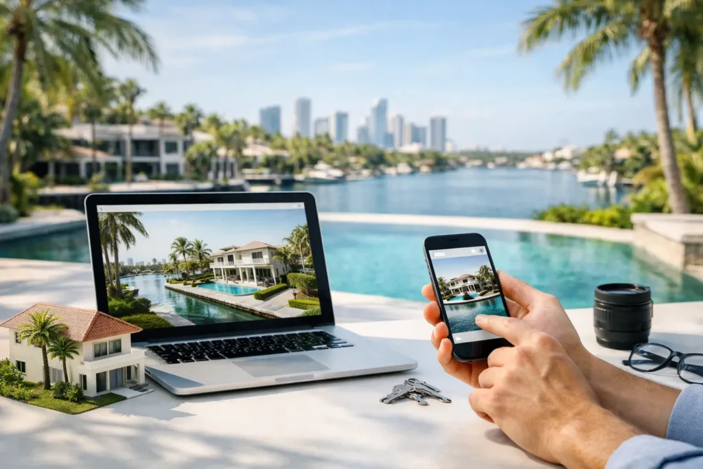
A listing can have professional photos, an accurate MLS entry, and a strong price point, yet still lose attention when buyers reach a weak property page. This property website guide is built for South Florida agents who need every listing to present clearly, load quickly, and give serious buyers a reason to book a showing.
A property website is not a digital flyer. It is the place where a buyer decides whether a home deserves more of their time. In Miami-Dade, Broward, and Palm Beach, that decision often happens before an agent has a chance to explain the view, the light, the upgrades, or the lifestyle in person. Your page needs to do that work around the clock.
What a Property Website Must Accomplish
The best property websites answer a buyer’s practical questions while building emotional momentum. They show how the home looks, how it flows, where it sits, and what daily life there could feel like. Just as importantly, they make it easy for a qualified lead to take the next step.
For agents, the payoff goes beyond a polished presentation. A dedicated listing page gives you a controlled marketing asset that can support email campaigns, social media, agent outreach, paid advertising, and open-house follow-up. Unlike a crowded portal page, the property remains the focus, without competing listings pulling attention away.
That does not mean every property needs the same production level. A well-priced condo may need sharp photography, a focused landing page, and a clear neighborhood angle. A waterfront estate or luxury new construction project may warrant drone footage, cinematic video, a 3D walkthrough, floor plans, and a more detailed lifestyle story. Match the presentation to the listing’s value, buyer profile, and marketing strategy.
Property Website Guide: Start With the Buyer Journey
Buyers rarely consume a listing in a neat, linear order. Some start with photos. Others want the location, square footage, or monthly cost. Investors may look for rental potential, while relocating families may immediately look for schools, commute patterns, and usable bedroom layouts.
A strong page accounts for those different paths without becoming cluttered. The first screen should establish the essentials: a standout hero image or video, the property address, the price, key specifications, and a direct contact option. If someone lands from Instagram or a text message, they should understand the offer within seconds.
Below that, lead with visuals that tell the story in the right sequence. Start with the strongest reason to care, whether that is a Biscayne Bay view, a renovated kitchen, a pool, a walkable location, or a bright open living area. Then guide visitors through the home in a natural order. Random photo galleries make buyers work too hard to understand the space.
Your property description should support the visuals, not repeat every feature visible in the photos. Use it to explain the details that create value: impact windows, a newer roof, smart-home features, dock access, a flexible office, or an income-producing guest suite. Specific language sounds more credible than broad claims such as “stunning” or “one of a kind.”
Put Visual Assets to Work, Not Just on the Page
Professional photography is the foundation, but it is only one part of a high-performing listing experience. The right media format depends on what buyers need to understand before they visit.
Aerial photography and drone video help establish context. For a waterfront home, they can show proximity to the Intracoastal, beach, marina, or city skyline. For suburban properties, they can clarify lot size, backyard privacy, community amenities, and access to major roads. Used with purpose, aerial media gives buyers perspective that ground-level images cannot provide.
A listing video adds movement and atmosphere. It is especially valuable when the home has a strong indoor-outdoor relationship, dramatic architecture, or a lifestyle angle that still photos cannot fully communicate. Keep the pace focused. A two-minute walkthrough that highlights the best spaces will usually outperform a long video that treats every room the same.
Virtual tours serve a different purpose. Matterport and CloudPano experiences allow distant buyers, busy professionals, and pre-qualified prospects to explore at their own pace. They can reduce unnecessary showings because visitors arrive with a more accurate understanding of the layout. That is useful in South Florida, where relocation buyers and second-home shoppers may be evaluating properties from another state or country.
Floor plans deserve a place on more property pages than they receive. Photos create desire, but a floor plan helps buyers verify function. They can see bedroom placement, storage, room proportions, and how entertaining areas connect. For homes with unusual layouts, multi-level living, or converted spaces, that clarity can prevent confusion later in the process.
Make the Details Easy to Find
A buyer should not have to leave the page to locate basic information. Present property facts in a clean, scannable format, including beds, baths, interior square footage, lot size where relevant, year built, HOA details, parking, and property type. If there are meaningful upgrades or inclusions, name them plainly.
Location information needs judgment. A map is useful, but it should not be the full neighborhood story. Explain the real advantage of the location: minutes to Las Olas, access to Brickell, proximity to top golf, a quiet street near downtown Delray, or direct beach access. Avoid vague phrases about being “close to everything.” Buyers want to know what everything means for this specific address.
For condominiums and communities, include the features that influence a decision. Building amenities, pet policies, rental restrictions, security, valet, marina access, and maintenance fees can matter as much as finishes inside the unit. Clear details attract better-fit inquiries and save time later.
Build for Mobile First
Most listing traffic begins on a phone, often between appointments, after work, or while a buyer is comparing homes with a partner. If your page is difficult to navigate on mobile, slow to load, or packed with oversized media that does not display properly, the marketing investment loses value.
Use compressed, high-quality images and make sure video and virtual-tour embeds do not overwhelm the page. Keep the contact action visible without blocking the content. A tap-to-call button may be helpful for immediate interest, while a short form works well for buyers who want more information, a private tour, or disclosures sent to them.
Avoid asking too much too early. A form requesting a full profile can discourage a buyer who is still evaluating the home. Name, email, and phone are often enough for an initial inquiry. The goal is to make the next action feel simple, then let your follow-up process qualify the lead.
Give Every Listing a Clear Call to Action
“Contact us” is functional, but it is rarely persuasive on its own. Tie the action to what the buyer wants next. Invite them to schedule a private showing, request the full property package, ask about availability, or receive comparable homes in the area.
For an active listing, a scheduling option can turn interest into an appointment faster. For luxury properties, a discreet private-tour request may better match the audience. For developments or pre-construction inventory, a request for pricing and availability can be more appropriate. The right call to action depends on the sales process, but the page should make that path obvious.
Include agent branding with confidence, but do not let it overshadow the property. Buyers need to know who represents the listing and how to reach them. They do not need to navigate through a wall of biographies, badges, and unrelated services before they can see the home.
Measure What Produces Better Opportunities
A beautiful page should also be accountable. Track visits, traffic sources, time on page, video plays, virtual-tour engagement, form submissions, and showing requests. These signals reveal what is pulling attention and where buyers lose interest.
If social traffic is high but inquiries are low, the issue may be the audience, the offer, or the page’s next step. If visitors spend time on the virtual tour and then request showings, that format is helping qualify leads. If a key selling point is buried halfway down the page, move it higher and test the response.
The purpose is not to chase vanity metrics. A thousand low-intent visits do less for a listing than twenty well-matched buyers who understand the property before they arrive. Strong listing media and a focused property page help create that quality of attention.
A property website should make your next listing easier to understand, easier to share, and harder to overlook. When the visuals, information, and call to action work together, the page becomes more than a place to send traffic. It becomes a 24/7 open house built to move serious buyers closer to a decision.